It's all in the index you choose
Canadian and U.S. stock markets get equal treatment on the evening
news but it's easy to forget just how different they really
are. Investors, though, have had the distinction pressed upon them
this year, as the S&P/TSX 60 has slid 14.5 per cent, while the Dow
Jones industrial average (DJIA) has risen 6.8 per cent in Canadian
dollar terms.
To see what's going on, you have to look under the hood. Once you do,
the gaps between the two indexes loom large.
The DJIA is the granddaddy of market gauges and it follows 30 of the
most important firms in the United States. It's technically a scaled
average rather than an index because the portfolio it follows is
weighted by stock price. As a result, stocks with higher prices make
more of an impact. IBM and Chevron are the most influential at the
moment.
The S&P/TSX 60 index follows the performance of 60 of the largest
stocks in Canada. Like most other broadly based indexes, it's weighted
by market capitalization (shares outstanding times price per share),
which means that it tracks a portfolio that holds more of the largest
stocks and fewer of the smaller stocks.
While the S&P/TSX 60 tracks a greater number of stocks than the DJIA,
the reverse is true when it comes to the size of the individual stocks
that each holds. To get a quick sense of scale, there are about 350
stocks in Canada that have market capitalizations in excess of
$500-million while the U.S. has roughly 1,900 such stocks.
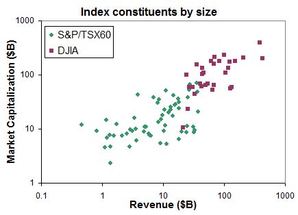
The accompanying graph plots the market capitalization of each
company in the DJIA, and the S&P/TSX 60, versus its latest annual
revenue using data from globeinvestor.com. (A log scale is used on
both axes of the graph to allow for the easy comparison of wildly
different figures.) You can see that the stocks in the DJIA all
cluster at the top right of the graph, which makes them much larger on
both measures than the stocks in the S&P/TSX 60. That is, they
generally have bigger market capitalizations and revenues. Simply put,
the DJIA truly follows huge stocks whereas the S&P/TSX 60 merely
tracks large stocks.

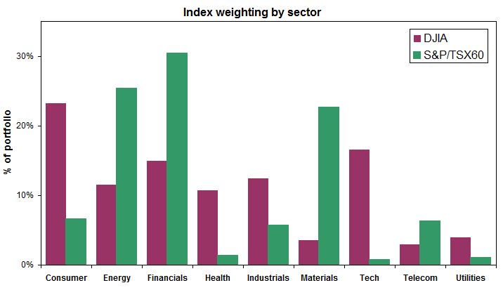
The types of businesses in each benchmark are also different. The
accompanying chart also highlights the distinctions and it shows
the percentage weighting of each sector based on data from
ishares.ca. Stocks in the financials, energy and materials sectors
(think banks, oil and gas, and mines) dominate the Canadian market. On
the other hand, the DJIA has more technology, industrials, health care
and consumer-oriented firms.

[larger graph]
One can easily point to even more differences, but the contrast should
already be clear. For investors, disparity can be a good thing because
two such distinct benchmarks offer diversification possibilities. Just
don't expect the indexes to follow each other in lockstep.
First published in the Globe and Mail, December 17 2011.
|
|