The scourge of inflation
Inflation is the silent killer of retirement dreams. It sneaks in over
the years and nibbles away at nest eggs, leaving people poorer than
they once thought.
How does it do the dastardly deed? By reducing the purchasing power of
money over time.
You can see its impact in the rising prices of many goods and services
over the past few decades. A generation ago you might have been able
to buy a nice home for $50,000; the same house today might set you
back $250,000.
To see the bite inflation can take out of your retirement plans, let's
start with the happy picture you may have spotted at your financial
advisor's office. It's the graph showing the long-term returns of the
S&P500.
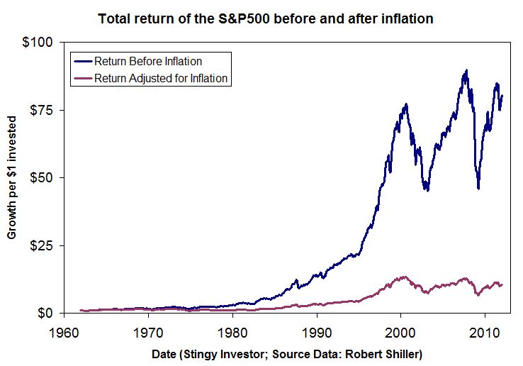
Sure the index bounces around, but the overall picture, as depicted in
the accompanying graph, is mighty impressive. The index managed an
average total return of 9.2 per cent a year since the early 1960s,
which sounds more than big enough to satisfy most investors.

[larger version]
But that figure doesn't account for the impact of inflation. After
that sneak thief had his way, the return pattern follows the much
lower line on the graph. Your inflation-adjusted return would have
amounted to an average of only 4.8 per cent a year.
If you hadn't properly adjusted for inflation, you might have spent
too much early in retirement based on the high dollar returns and been
left with too little purchasing power later on.
Inflation doesn't work alone. It does its dirty work in combination
with partners, like taxes and fees, that can take additional bites out
of your results.
Start with that 9.2 per cent return, take out a 2 per cent fee for the
management of your mutual funds, pay a quarter of the gains in tax,
and then see inflation run at 4.1 per cent and you're left with a
return of about 1.3 per cent. That's not much to live on despite the
market's very good return before all of these factors are taken into
account.
Even worse, the market can go into prolonged swoons, where
inflation-adjusted returns fall below even these modest levels. Since
the S&P 500 peaked in 2000, returns have actually been negative. There
are also other similarly long periods when the index declined in value
after adjusting for inflation.
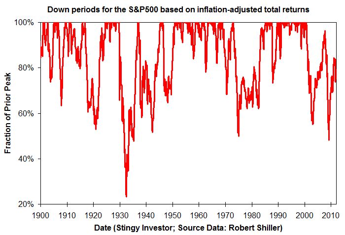
You can see the sorry history in the accompanying graph which shows
declines in the inflation-adjusted index from its prior peak
level. While we are now in one such period, the 1970s and the 1930s
weren't much fun either.
If the current downturn persists for a few more months, it will
eclipse the 1973 to 1985 malaise in duration. Is it any wonder that
more and more people are postponing their retirement these days?

[larger version]
First published in the Globe and Mail, January 14 2012.
|
|